


Top 7 JavaScript Chart Libraries for Financial and Scientific Web Apps
Financial and scientific web apps usually need more than basic dashboard charts. Trading terminals, market data tools, laboratory software, medical systems, engineering platforms, telemetry screens, and research dashboards all depend on precise data visualization. These products often deal with dense time series, live values, zooming, panning, annotations, comparisons, and detailed user interaction. Charting quality affects how users analyze data, not only how the interface looks. The wrong library can slow the product down or limit future visualization work.
This list compares libraries by rendering behavior, technical chart support, time series handling, interaction quality, documentation, framework fit, and practical use in financial or scientific products. The tools below are not seven versions of the same charting approach. Some are better for heavy browser visualization, while others make more sense for focused market charts, analytical tables, time series, or lighter technical reports. The main selection criteria were:
- Ability to handle dense or frequently updated datasets;
- Support for time series, technical charts, and analytical views;
- Interaction quality during zooming, panning, tooltips, and annotations;
- Fit for browser-based products with long-term maintenance needs;
- Documentation, examples, licensing, and implementation effort.
The list starts with the most relevant option for demanding financial and scientific visualization, then moves through lighter, more focused, or more general tools.
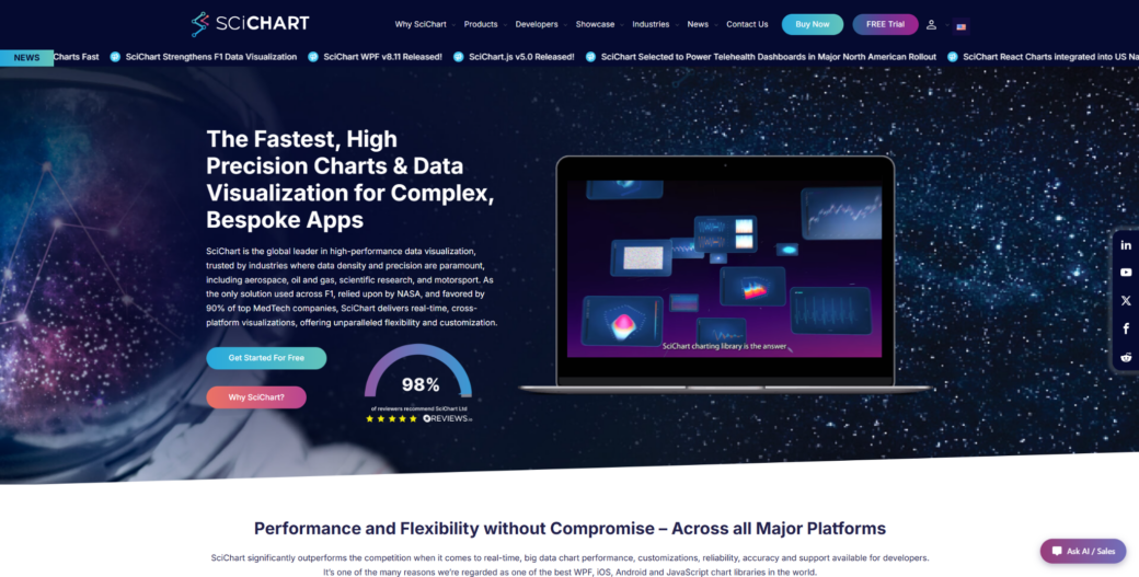
1. SciChart
SciChart is a JavaScript charting library for technical products that need fast rendering, advanced visuals, and detailed interaction with large datasets.
SciChart fits financial platforms, scientific interfaces, engineering tools, medical software, and monitoring products where charts carry serious product value. In these environments, SciChart performance charting library can handle large browser-based datasets, live updates, zooming, panning, annotations, and technical chart interaction. It is not the easiest option for a small dashboard or a basic reporting page. Its value becomes clearer when users rely on charts to inspect, compare, and act on data. SciChart is strongest when chart speed and visual depth directly affect user decisions.
Financial and scientific applications often need charts to stay responsive while users inspect dense data, compare values, and move through historical or live series. SciChart supports advanced visual types such as 2D charts, 3D charts, heatmaps, gauges, polar charts, and technical chart layouts. Documentation, examples, demos, and support reduce implementation risk during product development. The library is commercial, so it makes the most sense when advanced visualization is important enough to justify the license. For teams building chart-heavy products, that tradeoff can be easier to defend than fighting performance limits later.
SciChart’s value comes from the mix of rendering speed, chart depth, interaction control, and support for serious product use. It handles browser load well, keeps interaction smooth, and gives teams room to build large-scale technical visualization without starting from scratch. The most practical reasons to consider it are:
- Handles large datasets and frequent updates in browser-based products;
- Supports 2D charts, 3D charts, heatmaps, gauges, polar charts, and other advanced visuals;
- Gives developers control over annotations, styling, interactions, and chart behavior;
- Fits financial, scientific, engineering, medical, and monitoring use cases;
- Provides examples, demos, documentation, and support for production implementation.
Consider SciChart when charts are central to how users read, compare, and act on data. It may be too much for simple reporting screens, but it is highly relevant for technical products where chart quality affects workflow. For focused financial time series, TradingView Lightweight Charts offers a different tradeoff.
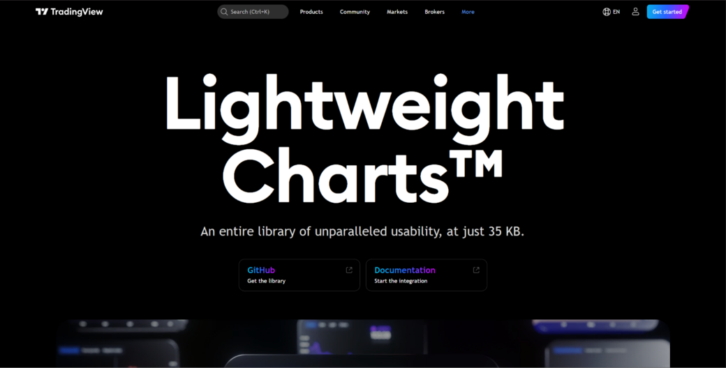
2. TradingView Lightweight Charts
TradingView Lightweight Charts is a financial charting library focused on clean, fast, and lightweight market data visualizations.
TradingView Lightweight Charts is a focused tool for financial time series rather than a general charting library. It suits price charts, market dashboards, crypto interfaces, portfolio tools, and trading-related web apps. Its appeal comes from lightweight rendering and a familiar financial chart style. It is not a full scientific visualization toolkit. The library makes sense when the product mainly needs clean market charts instead of a broad chart variety.
Financial apps often need responsive time series charts that users can scan quickly. TradingView Lightweight Charts supports candlestick-style views, line charts, price movement, historical data, and chart interaction. Its narrower focus can be an advantage when the product is centered on market data. Teams needing maps, 3D charts, scientific plots, or deep custom visuals will likely need another library. The main value is speed and clarity for financial charting.
This library is useful for focused market interfaces. It keeps the chart presentation clean and familiar for finance users without adding unnecessary visual weight. The main reasons to consider it are:
- Focuses on lightweight financial charting for market data products;
- Suits price charts, portfolio tools, crypto dashboards, and trading interfaces;
- Keeps the chart presentation clean and familiar for finance users;
- Reduces unnecessary weight when the product needs focused time series visuals;
- Works better for financial charts than for broad scientific visualization needs.
TradingView Lightweight Charts is useful when the financial chart itself is the main requirement. It is less suitable when a product needs many non-financial chart types or heavy custom scientific views. For analytical interfaces that combine tables and streaming data, Perspective offers a different angle.
3. Perspective
Perspective is an open-source analytics tool for interactive data tables, streaming data views, and connected visual analysis.
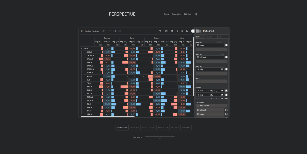
Perspective is better understood as a tool for data-heavy analytical interfaces than as a classic chart library. It fits financial dashboards, real-time analytics, trading operations, internal research tools, and data exploration screens. Its value lies in combining data tables, streaming updates, and visual views. It is not the best option for polished customer-facing chart design. Perspective is most relevant when the product needs interactive analysis around changing datasets.
Many financial and scientific tools are not only about charts. They often need tables, filters, grouping, aggregation, streaming values, and visual summaries in one interface. Perspective can help when users need to inspect and reshape data while still seeing visual output. That makes it useful for workflows where the chart is connected to active data exploration. Design-heavy dashboards may need extra UI work around it.
Perspective fits products where data analysis and charting sit close together. It works with streaming or frequently changing datasets and can support interfaces where users need to explore data from several angles. Its main strengths are practical:
- Supports interactive data views for analytical and technical interfaces;
- Works with streaming or frequently changing datasets;
- Combines tables, grouping, filtering, and visual exploration;
- Fits financial operations tools, internal analytics, and research dashboards;
- Makes sense when users need to inspect data, not just view a static chart.
Perspective is a good option when the product experience includes active data exploration. It may not replace a specialized charting library for advanced scientific plots or highly branded visuals. For dense time series line charts, Dygraphs provides a more focused approach.
4. Dygraphs
Dygraphs is a JavaScript charting library focused on dense time series and interactive line charts.
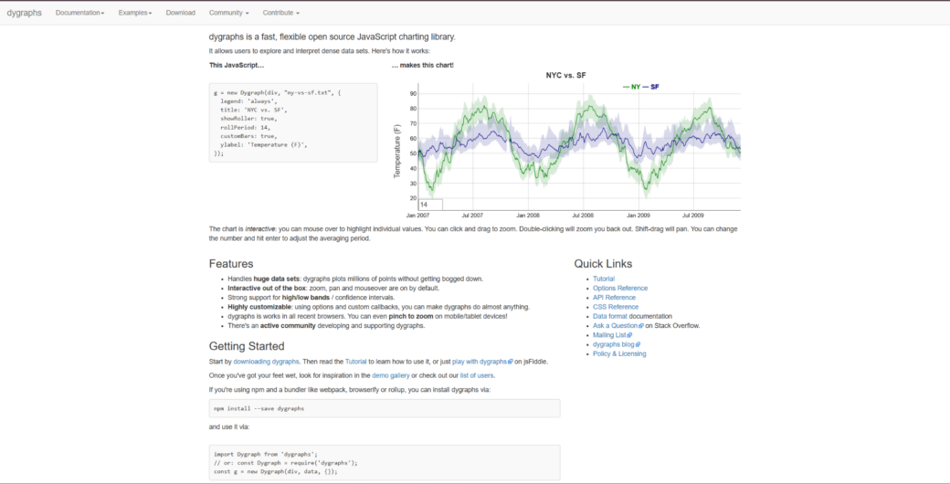
Dygraphs is a focused library for time series visualization. It suits scientific measurements, sensor readings, historical data, monitoring views, research dashboards, and technical line charts. The library is useful when the main job is exploring dense data over time. It is not a modern all-purpose dashboard suite. Dygraphs makes sense for teams that need practical time series charts without a large visual system.
Scientific and technical users often need to zoom, inspect, compare, and read trends across long datasets. Dygraphs can be relevant when those interactions matter more than polished UI presets. Its narrower scope can be a strength if the product does not need many chart families. It keeps attention on time-based analysis rather than broad visual presentation. Teams building advanced product dashboards may need more design flexibility or broader chart coverage.
Dygraphs is a practical time series option for technical use cases. It is most useful when line charts, dense datasets, and interactive inspection are the main requirements. The key strengths are:
- Handles dense time series and interactive line charts;
- Supports technical use cases involving measurements, trends, and historical data;
- Allows users to inspect data through zooming and chart interaction;
- Keeps the focus on time-based analysis rather than broad visual design;
- Suits research, monitoring, and scientific dashboards with clear line chart needs.
Dygraphs is useful when the project needs focused time series exploration. It is less convincing for teams that need modern UI polish, maps, 3D views, or a large chart catalog. For a simpler D3-based option for standard technical dashboards, C3.js offers a different path.
5. C3.js
C3.js is a D3-based charting library that gives teams a simpler path to standard JavaScript charts.
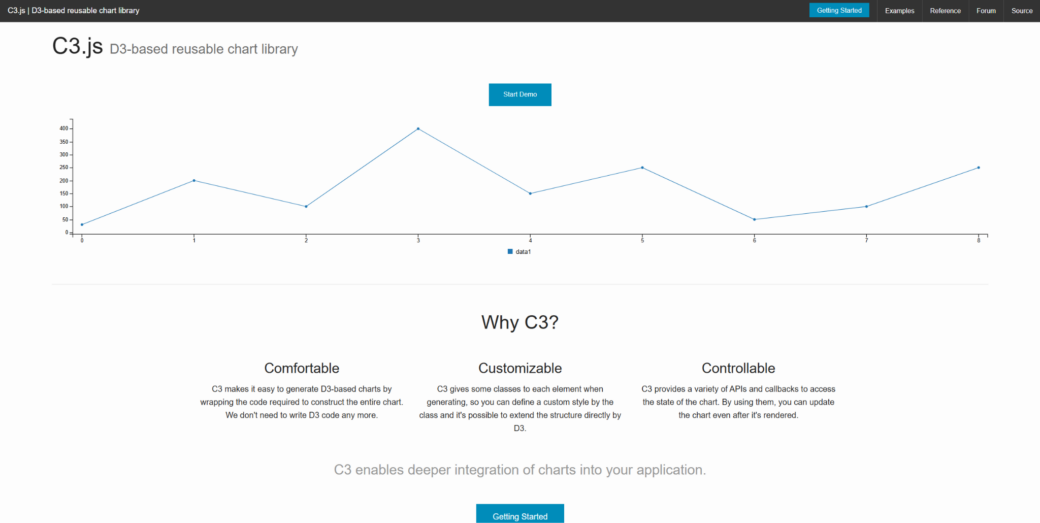
C3.js is built on D3 and reduces manual chart setup for common chart types. It fits technical dashboards, internal reports, analytics screens, and simpler data products. It is not the same as using raw D3.js for a fully custom visualization. It should not be treated as the strongest choice for heavy scientific or high-frequency financial workloads. C3.js can work when a team wants familiar charts without deep low-level development.
Some financial or scientific products only need standard charts to support the main interface. In those cases, a simpler D3-based tool can be practical. The library supports line, bar, area, and other common charts. It can help teams add useful visuals without turning charting into the main engineering problem. Project activity, long-term maintenance, and fit with the current stack should still be checked.
C3.js is a lightweight middle option for standard charting. It provides common chart types with less manual setup than raw D3.js. Its strongest use cases are straightforward technical dashboards and internal analytics screens:
- Provides common chart types with less manual setup than raw D3.js;
- Supports technical dashboards, reports, and internal analytics screens;
- Gives teams a familiar JavaScript charting path for standard visuals;
- Works when charts support the product but are not the main technical risk;
- Makes sense for simpler analytical interfaces that do not need deep custom visuals.
C3.js is more useful for standard charting than for advanced financial or scientific visualization. It can be practical in lighter technical dashboards, but teams should evaluate maintenance needs carefully. For a broader and more accessible charting option, Google Charts covers different ground.
6. Google Charts
Google Charts is a browser-based charting library for teams that need accessible charts with a familiar setup path.
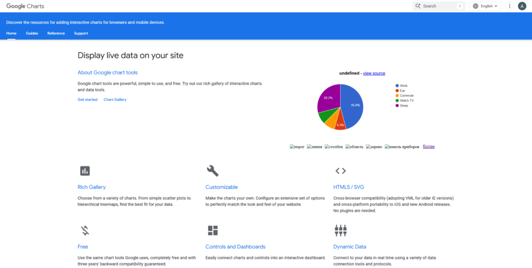
Google Charts is a general charting option for lighter technical dashboards and reports. It fits internal tools, education projects, research summaries, operational reports, and simple analytics interfaces. Its appeal comes from accessibility and a familiar Google-backed ecosystem. It is not a high-end engine for dense scientific or financial data. Google Charts works better for clear reporting than for specialized technical visualization.
Many teams do not need deep custom rendering for every technical dashboard. Sometimes they need charts that are easy to add, explain, and maintain. Google Charts can help in those lighter situations. It gives teams a simple route to common visual formats without requiring a specialized charting stack. Teams should be careful if they need heavy interactivity, full visual control, or advanced chart behavior.
Google Charts can still have a place in simpler technical products. It covers common chart types for reports, summaries, and dashboards. The main reasons to consider it are:
- Covers common chart types for reports, summaries, and dashboards;
- Offers a familiar setup path for teams that need quick chart output;
- Suits education, internal analytics, and operational reporting use cases;
- Works better for lighter dashboards than for high-load technical products;
- Makes sense when simplicity and accessibility matter more than deep customization.
Google Charts is practical when charting needs are modest, and the team wants a simple route. It is less relevant for products where chart interaction, performance, or custom design is central. For small time series and simple technical visuals, MetricsGraphics.js provides an even lighter approach.
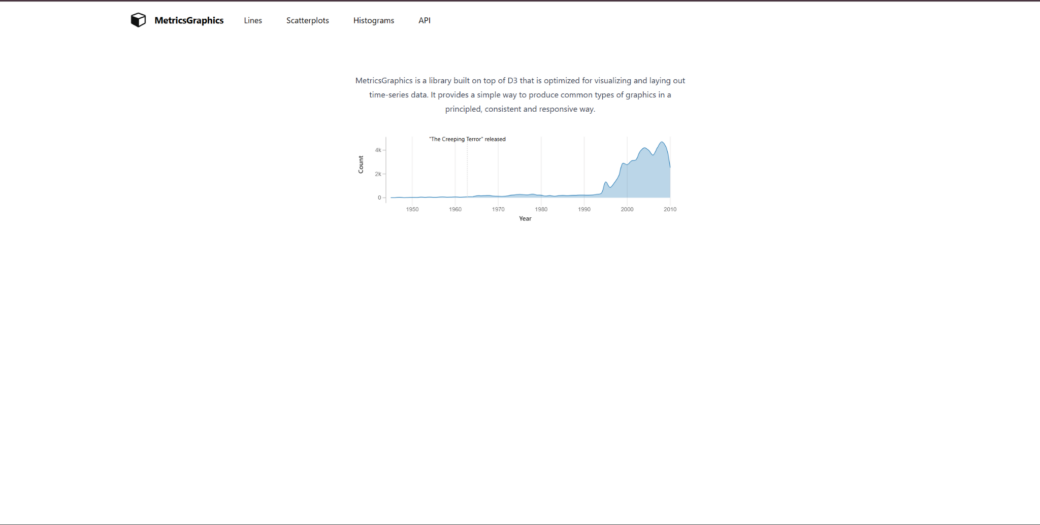
7. MetricsGraphics.js
MetricsGraphics.js is a small charting library aimed at simple data graphics, especially time series and analytical visuals.
MetricsGraphics.js is a lightweight option for simpler analytical graphics. It suits time series, research summaries, internal dashboards, technical reports, and quick data views. It is not a modern heavy-duty charting platform. Teams should be careful before using it for demanding financial platforms or complex scientific products. MetricsGraphics.js may still fit small projects where simplicity matters more than broad chart depth.
Not every financial or scientific interface needs a large library. Some projects only need clear data graphics for a narrow set of use cases. MetricsGraphics.js can be considered when the charting layer is small, and the team wants a lightweight approach. That makes it more relevant for small internal tools or simple analytical pages than for serious production platforms. Project age, maintenance, and compatibility should be checked before adoption.
MetricsGraphics.js belongs here as a small, focused option. It can support simple analytical graphics and time series views without adding a large toolkit. The main points to check are:
- Supports simple analytical graphics and time series views;
- Fits smaller reports, internal dashboards, and research summaries;
- Keeps charting focused when the product does not need a large toolkit;
- Works better for narrow visual needs than for complex technical platforms;
- Requires careful review of maintenance, compatibility, and long-term fit.
MetricsGraphics.js is not a direct rival to heavier charting tools. It can help with simple technical visuals, but teams should be careful before using it in serious production products.
Final Thoughts
Financial and scientific web apps need chart libraries that match the data load, interaction needs, and technical depth of the product. SciChart is the strongest option when advanced browser visualization, large datasets, and detailed interaction are central to the workflow. TradingView Lightweight Charts, Perspective, Dygraphs, C3.js, Google Charts, and MetricsGraphics.js each serve different scenarios, from focused market charts to lighter technical reports. No single tool is universally best. Test chart behavior with real datasets, zooming, updates, and maintenance requirements before choosing.